The Heatmap
The Heatmap makes recurring structures in your consumption visible. It shows at which times energy consistently flows at high or low levels.
Note: The Heatmap is part of the advanced analysis, which is included from the Plus plan upwards. Like the Day Profile, it also requires at least hourly values. If a metering point only delivers daily values, the page stays in the navigation and shows a notice instead of the colour grid.
How to read the Heatmap
The Heatmap arranges your consumption on two axes: weekdays from Monday to Sunday (horizontal) and hours of the day from 00:00 to 23:00 (vertical). Each cell is the average for that time slot across the selected period. The more intense the colour, the higher the consumption.
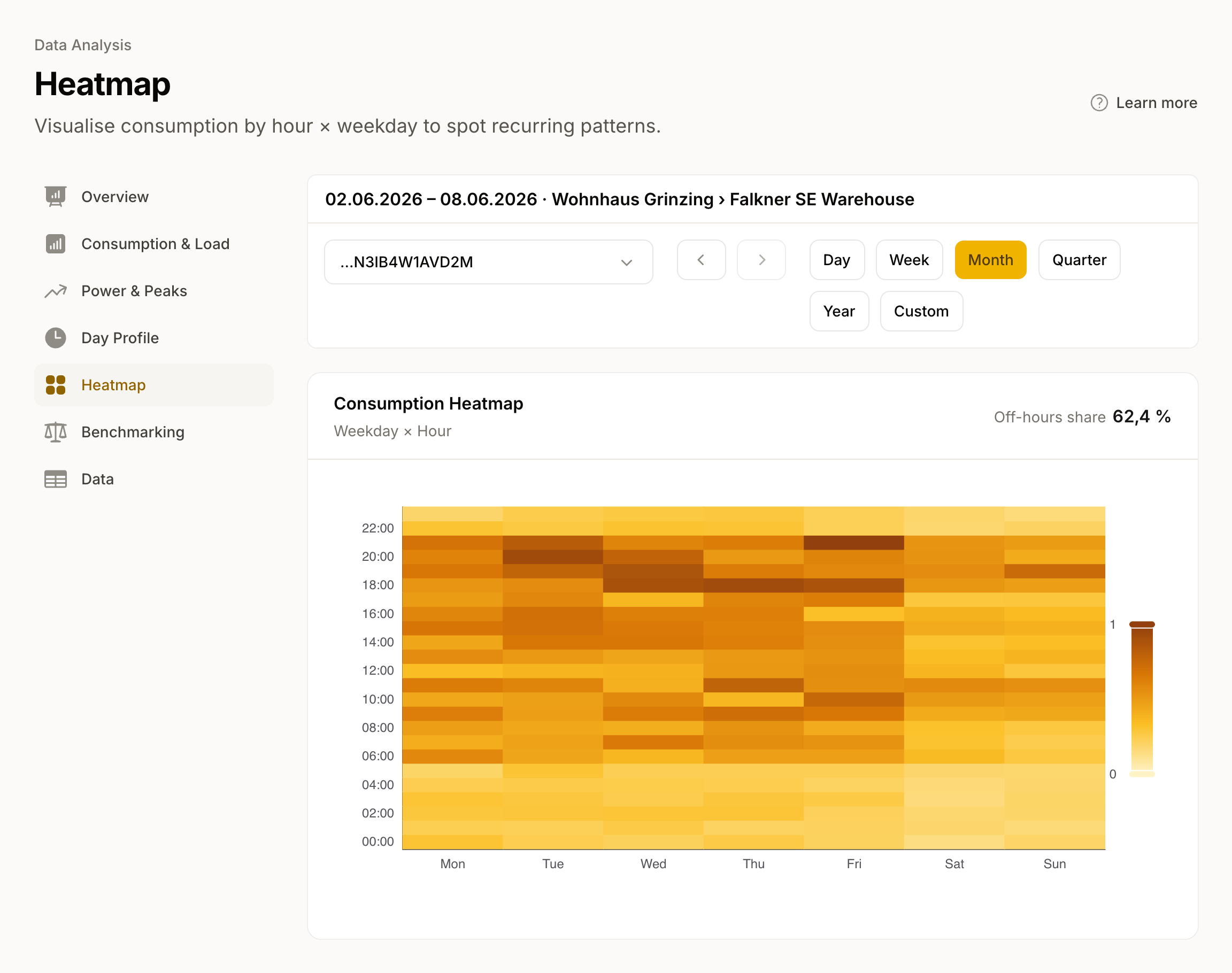
- Light cells: low consumption, for example at night or on weekends.
- Dark cells: high consumption, for example on weekdays during office hours.
- Uniform columns: similar daily pattern on all days of the week.
- High-contrast patterns: clearly defined usage times.
For feed-in meters, the Heatmap shows the fed-in energy instead of consumption.
Off-hours share
Above the Heatmap you see the KPI Off-hours share. It shows what proportion of your consumption falls outside core hours: on weekends, and on weekdays before 08:00 or from 18:00. A high share in a commercial building points to equipment running outside operating hours.
How to use the Heatmap
- High night-time consumption: Check standby loads, hot-water storage, or heating circulation pumps. Devices running unnecessarily at night push up the base load.
- No difference between weekdays and weekends: In commercial buildings this can indicate missing time controls for heating, ventilation, or lighting.
- Irregular patterns: In residential buildings these are normal, as consumption follows the occupants' daily routines. In commercial buildings it is worth a closer look at operating hours.
Related views
- The Day Profile condenses the same information into an average daily curve, split by weekday and weekend.
