The Overview
The Overview is your starting point in Data Analysis. It shows the most important metrics for your selection at a glance, so you can immediately see whether your data is current and complete.
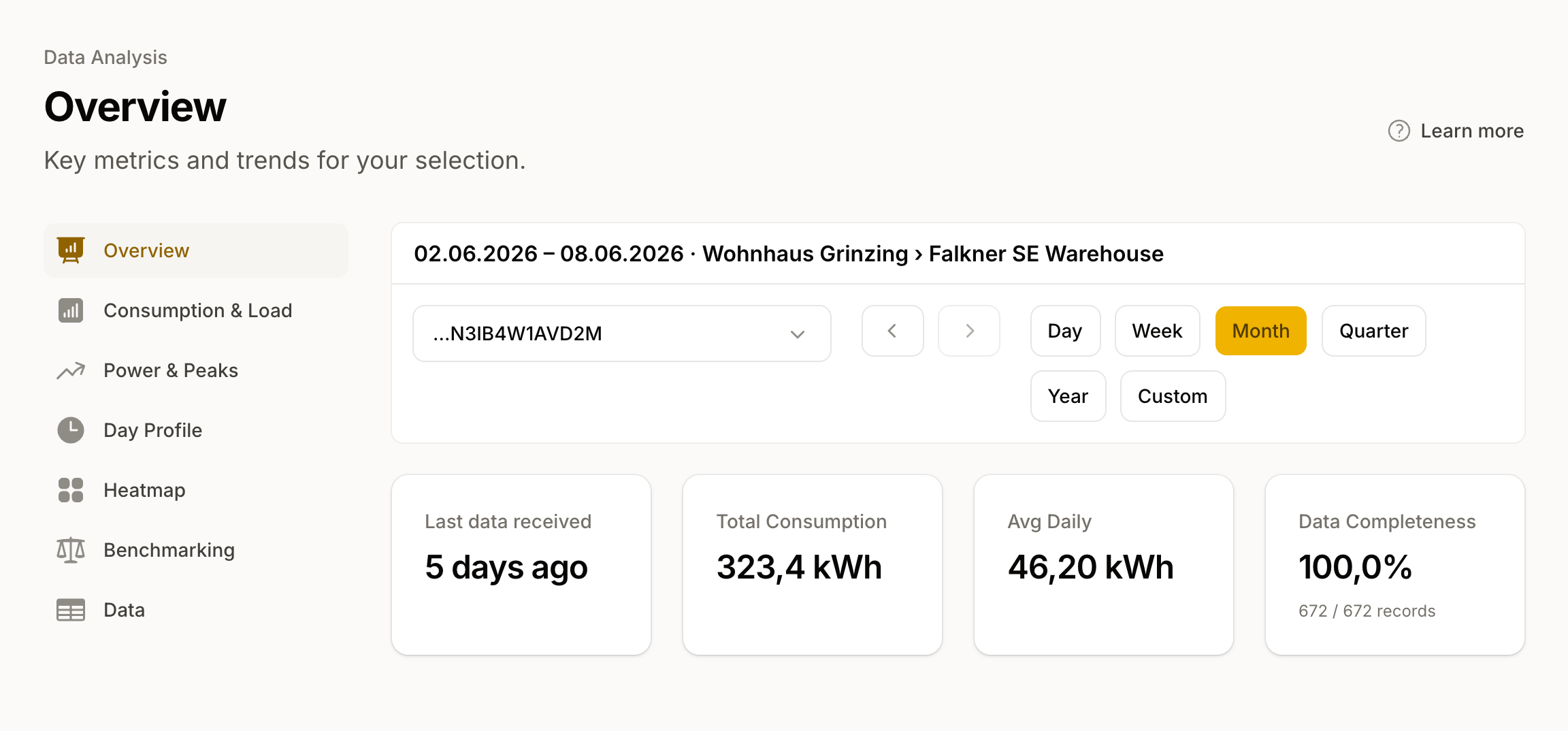
Your metrics
At the top you find the KPIs for the selected time range, in this order:
- Total consumption: The sum of all readings in kWh. For feed-in meters this shows the total feed-in.
- Avg daily: Total consumption divided by the number of days in the range.
- Community coverage: The share of your consumption supplied by the energy community, as a percentage and in kWh. This tile only appears for electricity meters with energy community data.
- Last data received: When the most recent reading arrived. The colour indicates freshness: green up to 48 hours, yellow up to 7 days, red beyond that. With multiple meters, we also show the oldest data point.
- Data completeness: The proportion of readings actually received against those expected, as a percentage. It appears as soon as we can calculate completeness for your selection. If the value falls below 95%, the reliability of the other analyses may be reduced.
Meters in view
If you have selected more than one meter, the table "Meters in view" appears below. Its columns are Meter, Direction, Last data, Period total, and Completeness; location and customer appear as a subline under the meter name. From there you can jump directly to the detailed analysis of a single meter.
When only daily values are available
If the selected metering point only delivers daily values from the grid operator, the notice "Limited Analysis" appears at the top. Day Profile, Power, and the Heatmap stay in the navigation, but show a notice instead of the analysis, as they need finer resolution. You can request quarter-hourly values from your grid operator.
How to use the Overview
The metrics show you where to look more closely:
- Data stale or incomplete? Check the data quality and reception under Measurement Data. Gaps often point to a communication problem with the smart meter.
- Consumption higher than expected? In Consumption you can find outliers and compare with the previous year. Under Power you see base load and your highest peaks.
- Looking for context? Benchmarking compares your consumption against typical values for your building type.
