Day Profile
The Day Profile shows the average pattern over a day, averaged across all days in the selected period. Two lines compare weekdays and weekends. You can see when the most energy is used on a typical day, and whether weekends differ from working days.
How to read the chart
The x-axis shows the hours of the day from Hour 00 to Hour 23, and the y-axis shows the average load in kW. Each point is the mean of that hour across all matching days in the period.
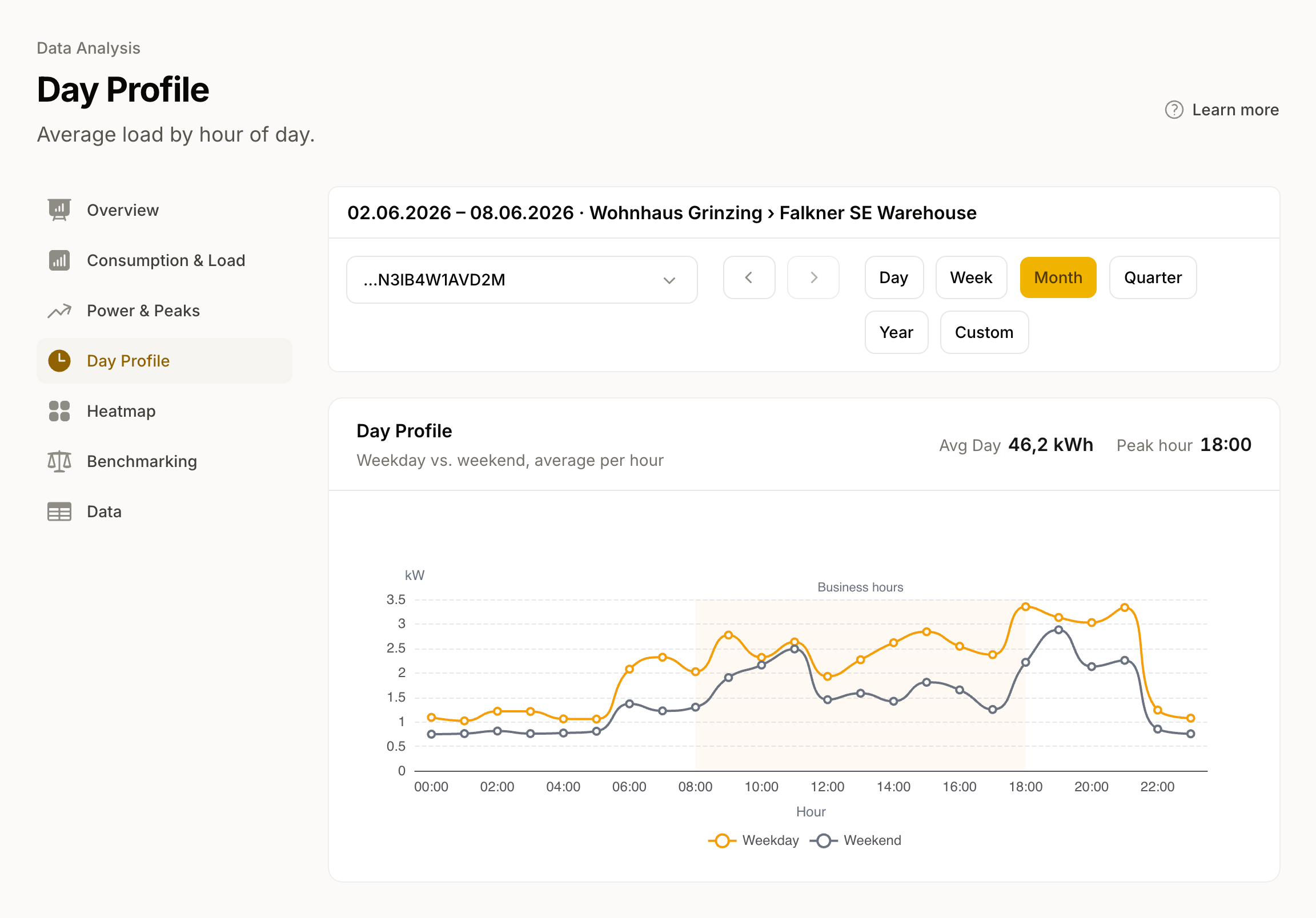
- Weekday (coloured line): Average across Monday to Friday.
- Weekend (grey line): Average across Saturday and Sunday.
A shaded band marks the Business hours band 08:00-18:00. Typical patterns:
- Morning and evening often show load peaks in residential buildings.
- Midday peaks are common in office buildings.
- At night you see your base load, the load that runs even when nobody is present.
Metrics
Above the chart you see two values: Avg Day as the average daily total in kWh, and Peak hour as the hour of the day with the highest average on weekdays.
When does this page appear?
Day Profile requires at least hourly resolution. If only daily resolution is available, the system hides this page from the navigation.
Related views
- The Heatmap shows the same information at finer resolution, as a grid of weekday and hour of day.
- Consumption & Load shows every individual day, not the average.